AHA teacher assistant · design directions · round 1 (superseded) · 12 Oct 2026
Five directions, the same four screens
Each direction draws the four moments that matter: Quick tap (entering one learner's results), Scan (reading a printed answer sheet), Results (what the class missed) and the Remediation plan (ILAW). The markup, the data and the numbers are identical in all five. Only colour, type, shape and texture change, so the comparison is fair. Every page has a Name picker in its header, so any name can be tried in any direction.
Not for teachers or the public yet. The class, the learners and the exam are illustrative. The figures are computed by the real rules in docs/02-requirements/05-business-rules.md.
Direction 1
Red Pen
Recommended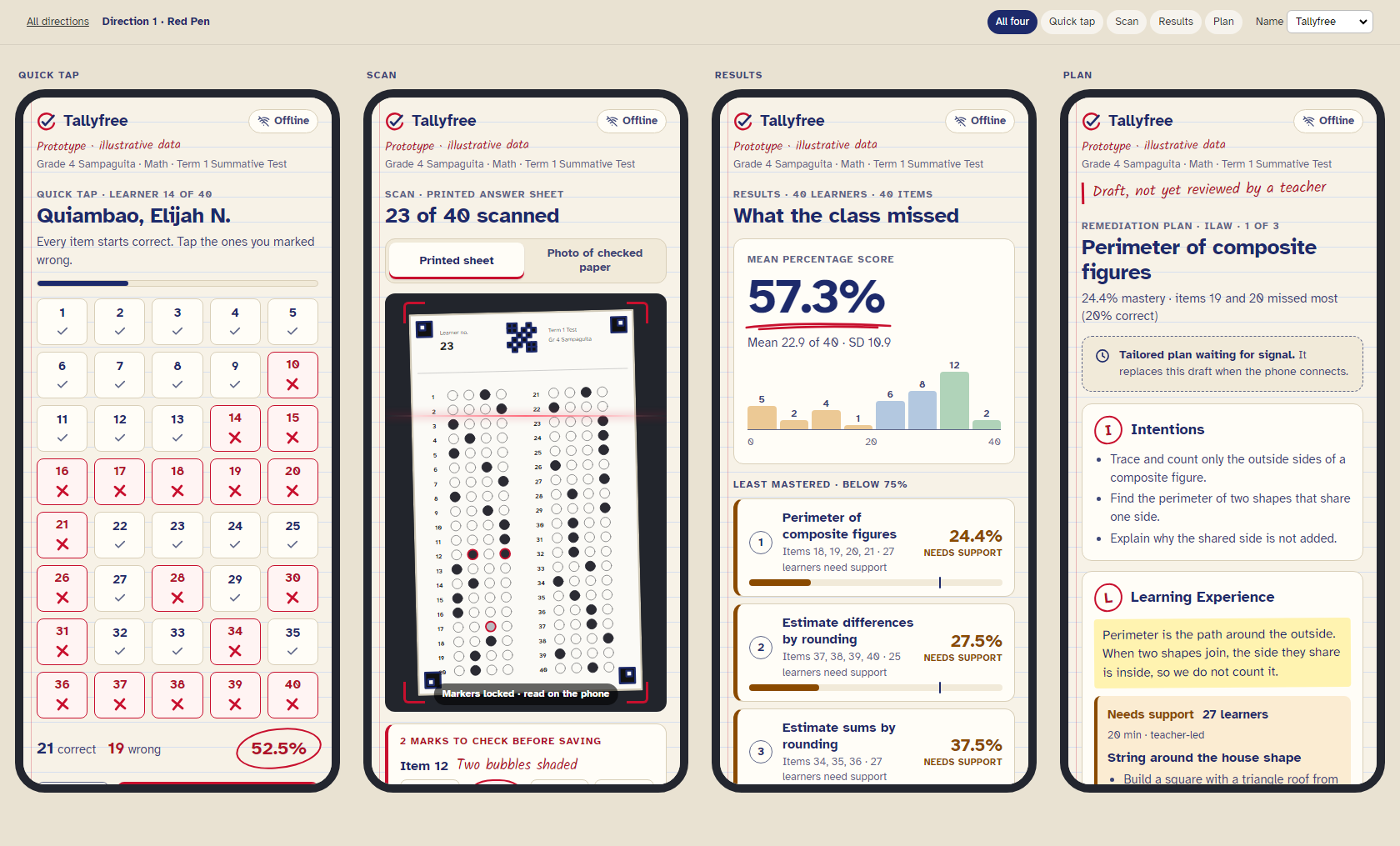
The teacher's own checking table. Pad paper with blue rules, ballpoint-blue ink, and the red pen for everything the teacher does. Wrong items get a drawn red X, the score is circled the way teachers mark papers, and the Draft notice is a margin note. Mastery levels never use the red pen's red.
Atkinson Hyperlegible + Kalam (annotations only) · light · about 85 KB of fontsDirection 2
Class Record
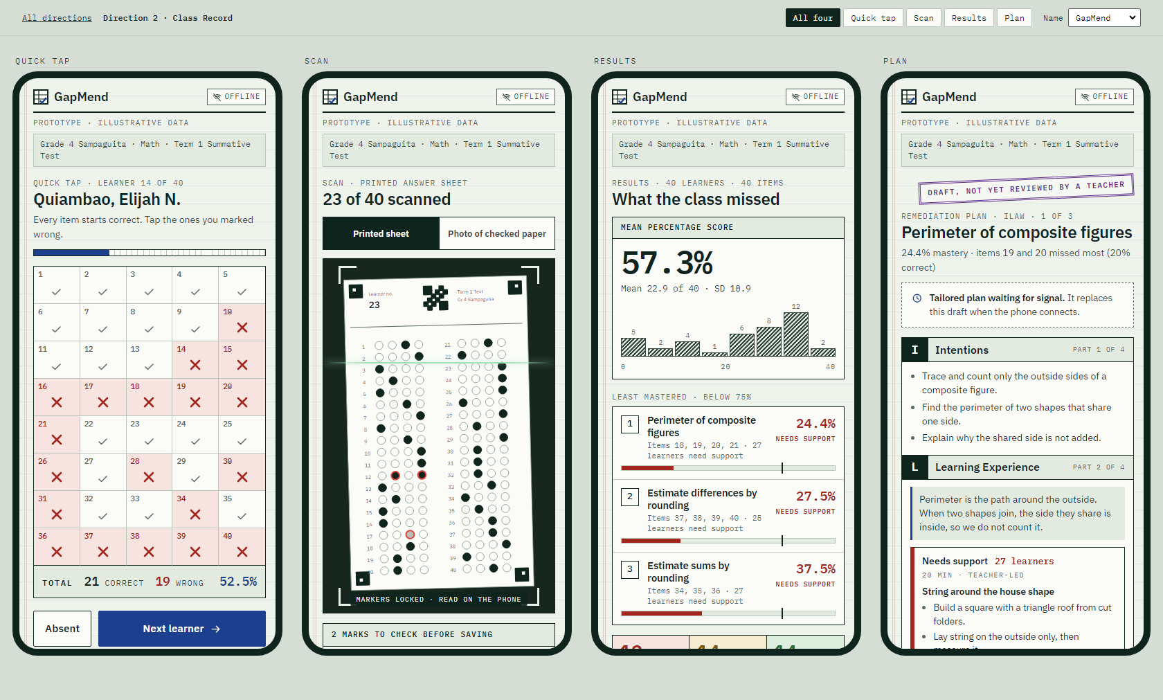
The register coordinators and divisions already trust. Ruled ledger green, sections that share rules instead of floating as cards, every figure in mono, Quick tap as a register row with a TOTAL line, ILAW parts as boxed form codes, and Draft as a rubber stamp.
IBM Plex Sans + IBM Plex Mono · light · about 80 KB of fontsDirection 3
Pisara
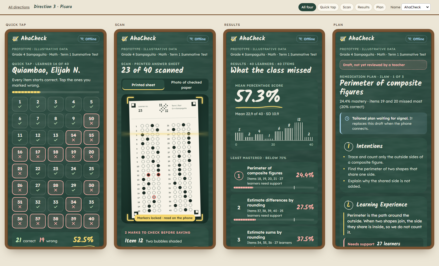
The chalkboard in every classroom. Board green, chalk white and yellow chalk for actions. The logo is a tally crossed by a check, the score spread is drawn as tally marks, the hero figure gets a chalk underline, and the answer sheet is white paper held up to the board.
Kalam (headings) + Lexend · dark · about 90 KB of fonts · daylight legibility to testDirection 4
Bayanihan
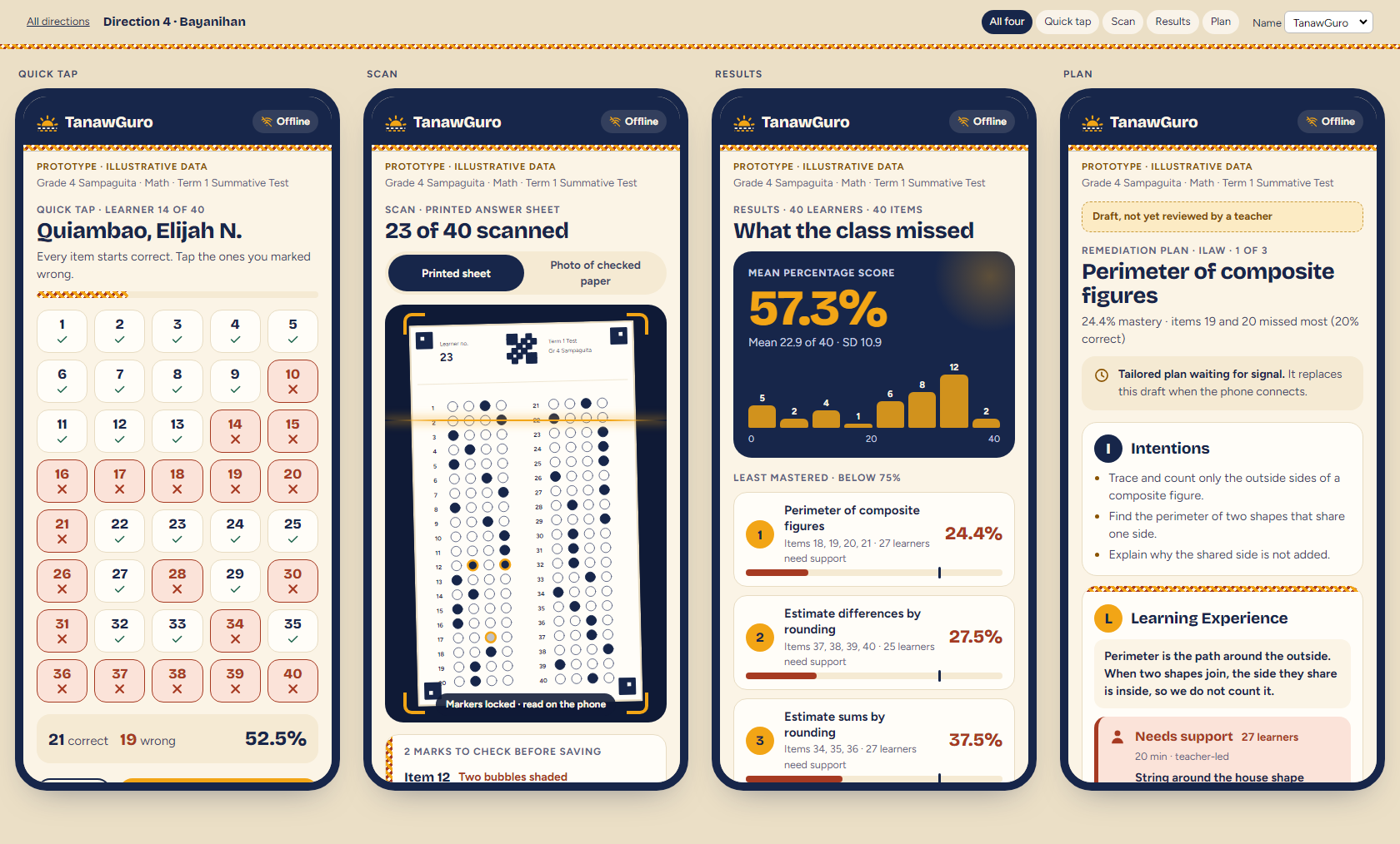
The community carrying the learner forward. Sunlit cream, sea-indigo and mango. A banig weave runs along the edges, the learner groups climb steps together (Mastered helps Approaching helps Needs support), and a half sun rises over a woven horizon. The one funders and AHA's comms team will like most.
Bricolage Grotesque + Figtree · light · about 70 KB of fontsDirection 5
Everyday
Alternate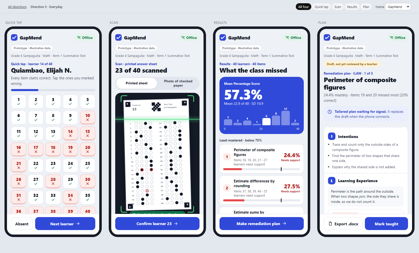
Like the apps teachers already use every day. E-wallet patterns: white cards, one cobalt, big bold numbers, status pills, a sticky bottom action, and the ILAW plan as a receipt with notched edges. Nothing to learn and nothing to download: it uses the phone's own font.
System font only · light · 0 KB of fonts · fastest on a 2 GB phoneIdentical in all five
- One class: Grade 4 Sampaguita, 40 fictional learners, a 40-item Term 1 Math test. MPS 57.3%. Least mastered: perimeter of composite figures (24.4%), estimating differences (27.5%), estimating sums (37.5%).
- One set of rules: mastery cutoff 75%, groups Needs support / Approaching / Mastered, item flags. Each figure is computed once from
prototype/content/by_shared/build_data.py, which fails if the numbers drift. - The same guards: an Offline indicator and a "Prototype · illustrative data" line on every screen, text contrast of at least 4.5:1, mastery always labelled in words and never shown by colour alone, and tap targets of at least 44 px.
Names
The shortlist and every check are in docs/01-brand/names.md. Domains were checked on 12 Oct 2026. Trademark (IPOPHL), .ph and social handles still need a manual check.
Recommendation (recommend, never pick)
Red Pen, with Everyday as the alternate. Red Pen is the only direction that could not belong to any other product. It is built from the exact moment the app replaces, the teacher with a red pen and a stack of papers, and it stays calm and legible in daylight. Everyday is the choice if speed on the cheapest phones outweighs character, since it downloads no fonts at all.
Name: GapMend says what the product does, and Tallyfree says why teachers will want it. Red Pen carries either. Pick with Patrick, then confirm with AHA.
How to review
- Open a direction and use All four / Quick tap / Scan / Results / Plan in the header. On a phone, open one screen at a time.
- On Quick tap, tap items to flip them between correct and wrong: the tally updates. On Scan, the A to D chips can be changed.
- Try each name with the Name picker. Choose one direction and one name (or two finalists) for G1.